On this page, you’ll find three projects that I selected from my time at AdvisorEngine.
Before we start, I’d like to give you a little background of the company.

 
AE ecosystem.png

AdvisorEngine owned an ecosystem covering all major touch points in financial advisory firms’ and clients’ journey. Their B2B and B2C products enabled financial advisors to focus on clients instead of busywork: find and onboard new clients, manage portfolios, stay organized with billing and files, and be on top of customer relationships.


My mission at AdvisorEngine was to improve the user experience for the end users, an area that AdvisorEngine was heavily investing in.

I looked at the end user journey map, and identified two most critical moments of truth: Evaluation and On-boarding. These are the make-or-break touch points that determine the foundation of the relationship, so I chose to take a close look at them.


The first moment of truth, Evaluation: Prospecting flow is a big part of how end users evaluate advisory firms. It gives users a taste of the firm’s approach by providing an instant diagnosis on a financial plan.

The previous flow had usability issues, mental model issues, and unaddressed edge cases. By visualizing the flow in diagrams, it was easy to see what went missing between intended purposes and what was delivered.


The second moment of truth, On-boarding: Once a prospect decides to become a client, the next thing they need to do is to transfer cash to fund their investment accounts. This step is crucial in getting clients on-boarded. However, the current workflow has some logical loopholes that made it unintuitive to use. I illustrated this problem using flow diagrams, and was able to quickly revise it from a high-level standpoint.


Lastly, I’d like to walk you through the redesign of Client Portal navigation. The project was initiated because client feedback showed that they had trouble locating functionalities. I teamed up with a PM, and took a deep look at how we organized information. I asked seven coworkers to join the pilot research project. Afterwards, based on the findings we received in the initial user research, we conducted usability testings with recruited users. The final outcome was a much more intuitive navigation system.

CP nav redesign 1.png

In order to get a clear understanding of how users organize information, I asked them to group functionalities based on association, and identify any dependency between data points.


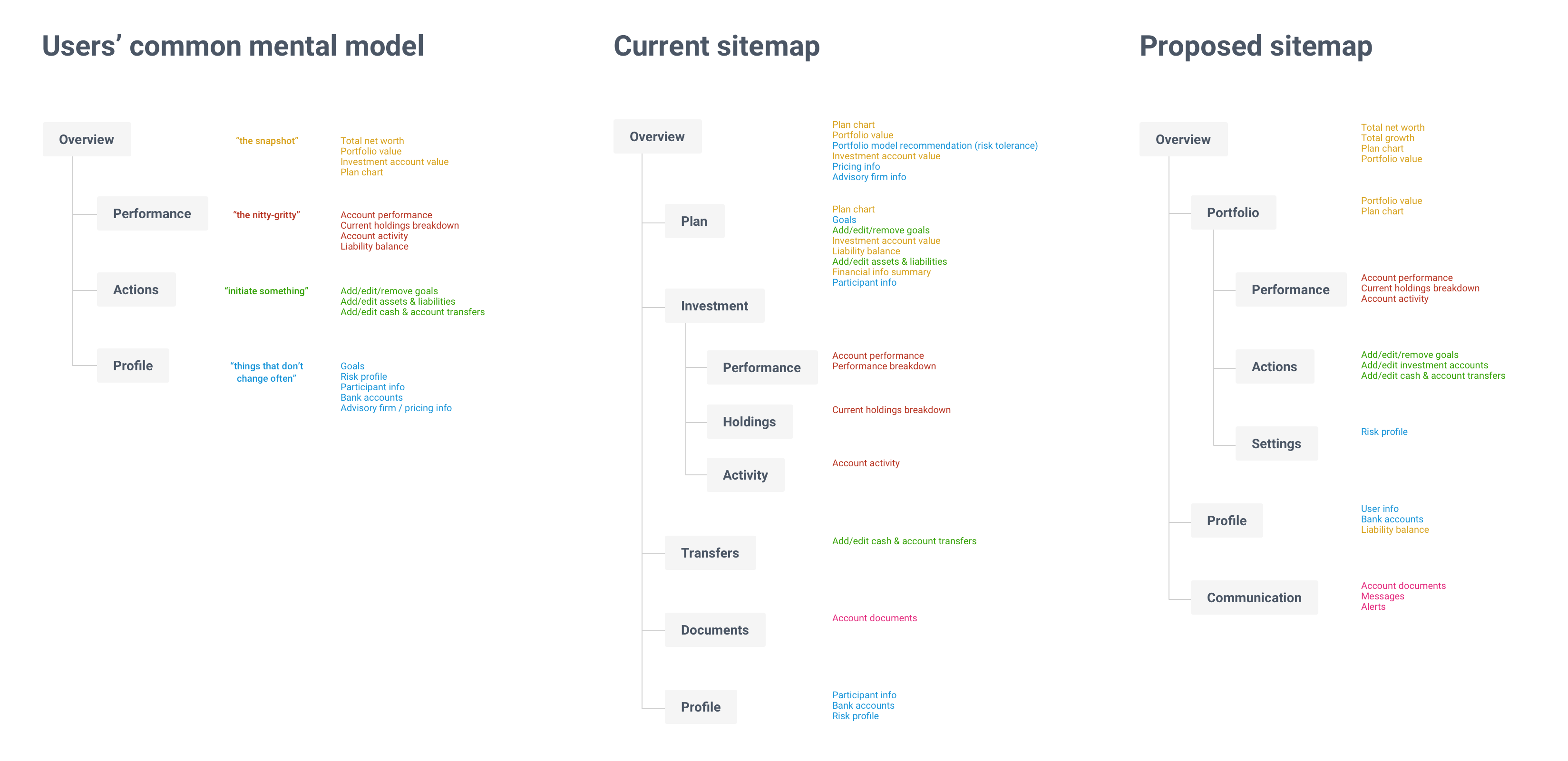
I found that most users have a common mental model that divides data/actions into four types: “the snapshot”, “the nitty-gritty”, “initiate something”, and “things that don’t change often”. Following this logic, it is easy to see why the current sitemap creates confusion — it lacks hierarchy for clear way-finding. I used color coding to visualize this problem, and was able to quickly optimize the sitemap.


After a few days of rapid prototyping, I put together a new design reflecting the revised navigation system.

In order to test how effective the changes are, the team recruited 8 users who have had experience with online wealth management tools. We conducted 3 rounds of A/B testings, and the feedback showed that the new navigation made it much easier to find information and take actions.

CP nav redesign 6.png