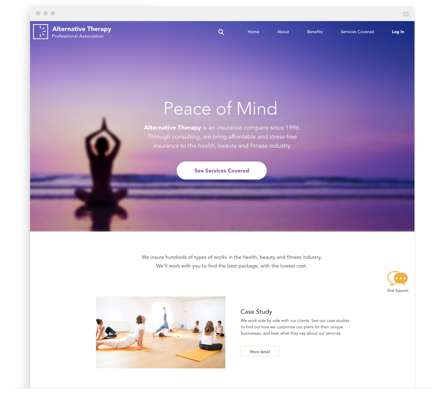
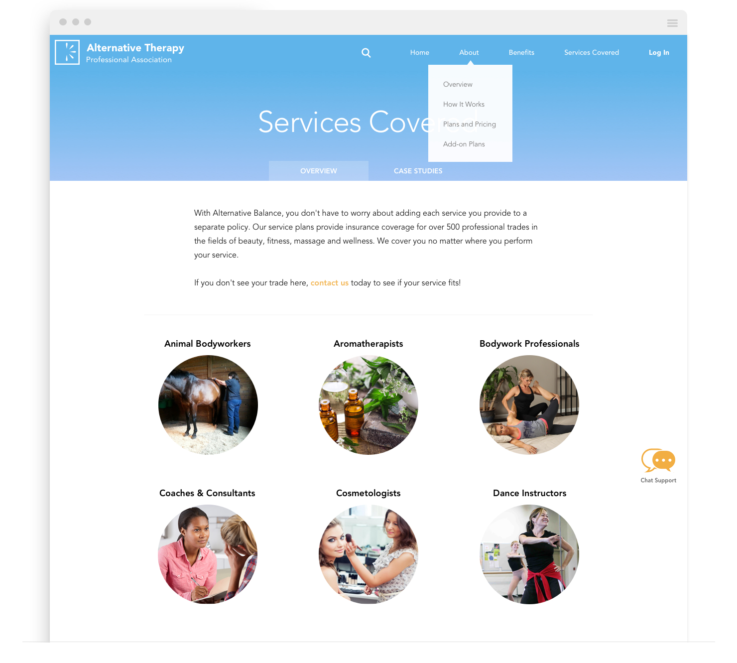
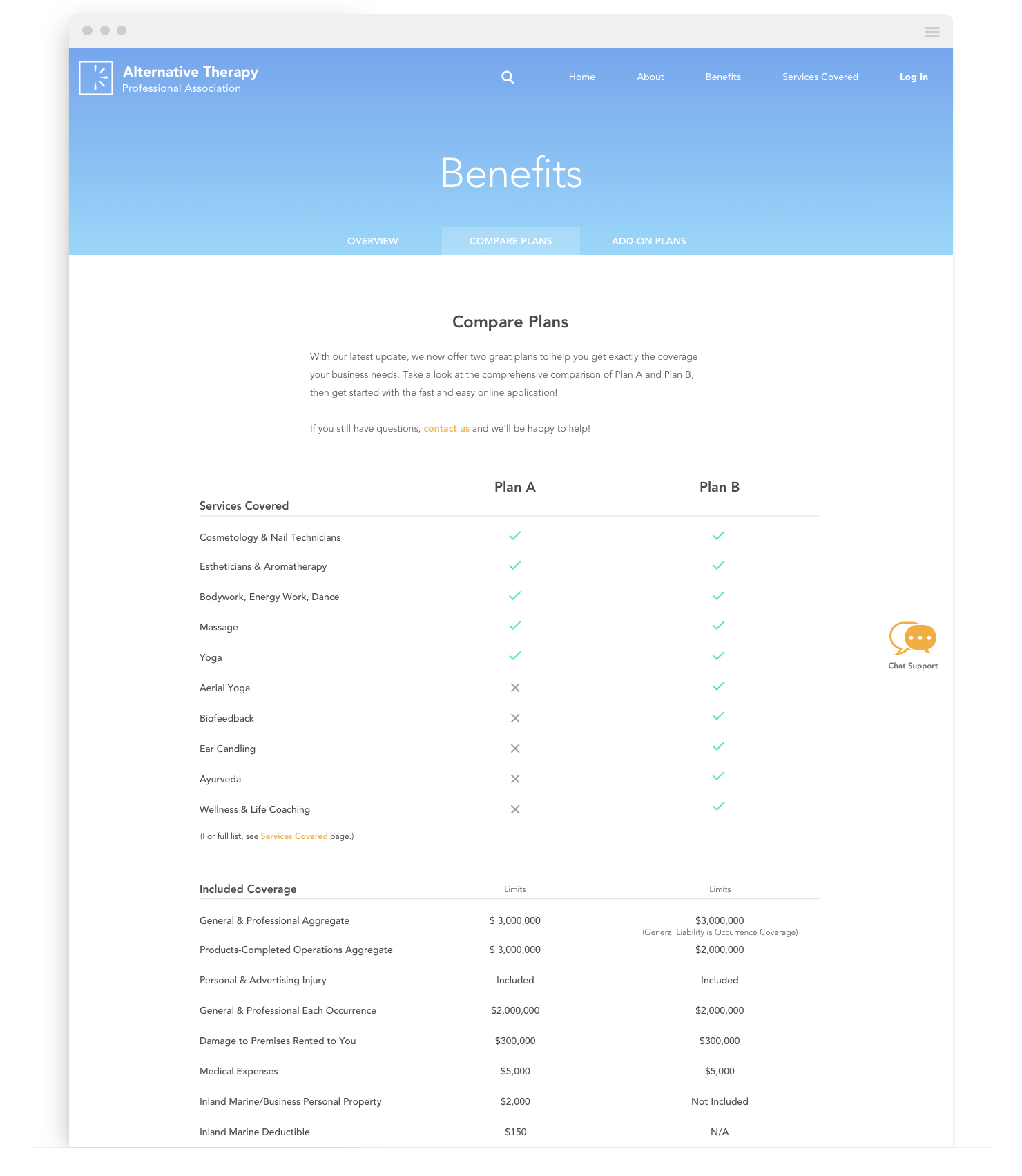
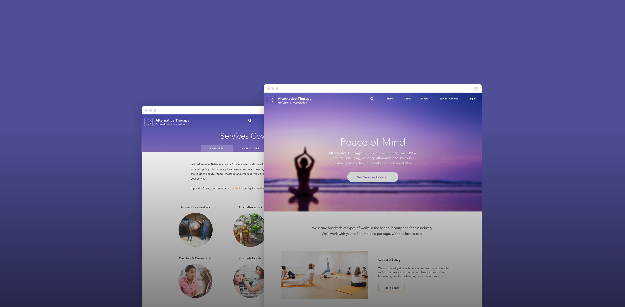
Overview

Alternative Therapy is an insurance company that sells policies to alternative health care providers. Their old website was text-heavy and lacking in visual hierarchy. It became clear that a redesign was needed to apeal to their increasingly younger user base.


MY ROLE
After analyzing the existing website, I took the initiative to improve the information architecture and navigation. To create a more delightful look and feel, I decluttered the UI and took a more visual approach to storytelling.

CHALLENGES
There was an overwhelming amount of information on the old website. It took some time figure out the most essential information on each page, and which pages can be consolidated.


Visual Style

One of the main goals of this project was to create a simple and elegant visual style in order to connect with the customers of this particular industry.


BEFORE
The old website was jammed with texts and had low visual hierarchy. The terminology used for navigation were confusing for users. The color choices also needed improvement. 

AFTER
The new design adapted a more visual storytelling style, and eliminated texts to a minimum level. It used simpler wording in the navigation menu to avoid confusions. The color palette also became more sensual. 


Information Architecture

Because of its B2B nature, Alternative Balance provided a variety of services that became overwhelming when there's a lack of visual hierarchy. To solve this issue, I redesigned the navigation system to help guide users find the information that they need in the least amount of time.

Web - Services covered.jpg
 

The checkout process was also changed from one long web page to a guided experience with clear navigations. Elements like anchored Order Summary window was also used to increase transparency in during purchase.